10 Tips for Creating Stunning Bespoke Labels for Your Brand
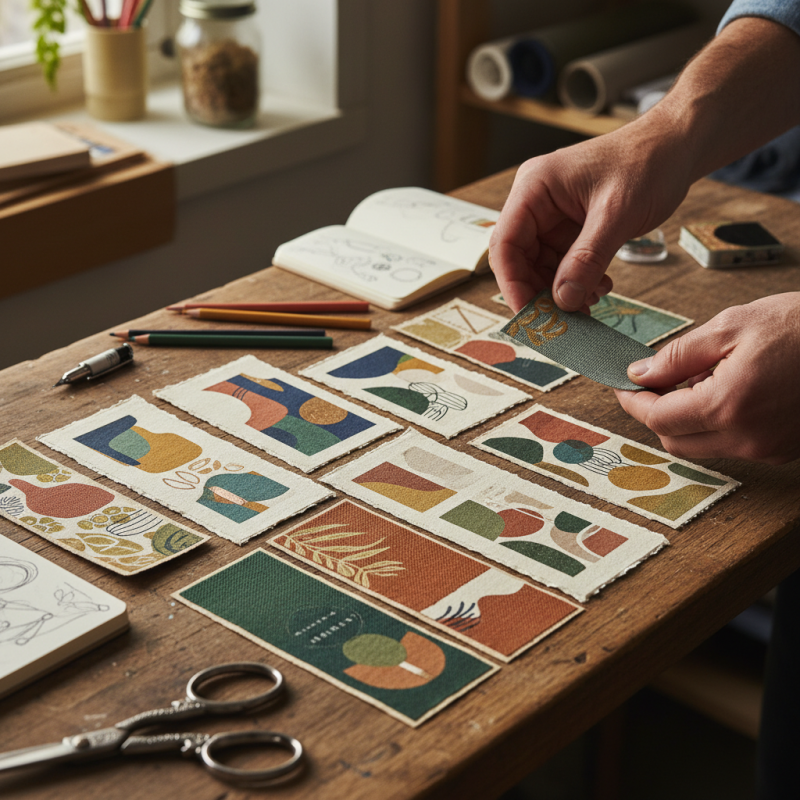
Creating stunning bespoke labels is essential for any brand aiming to stand out. These labels tell your brand story and reflect your unique identity. They play a crucial role in packaging design and customer perception. When crafted thoughtfully, bespoke labels elevate your product and create a memorable experience.
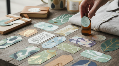
Designing bespoke labels can sometimes feel overwhelming. Many brands struggle with identity and clarity in their messaging. Ensuring your labels resonate with your target audience requires time and care. Focus on colors, fonts, and materials that capture your brand’s essence. Remember, even small details matter; they can leave a lasting impression.
Bespoke labels are not just about aesthetics; they convey meaning. Think about the emotions you want to evoke. It is a chance to connect with your customers on a deeper level. However, mistakes can happen during the design process. Imperfections can highlight the handmade quality of your product. Reflect on your vision, adapt, and create something truly unique.
Understanding the Importance of Bespoke Labels in Brand Identity
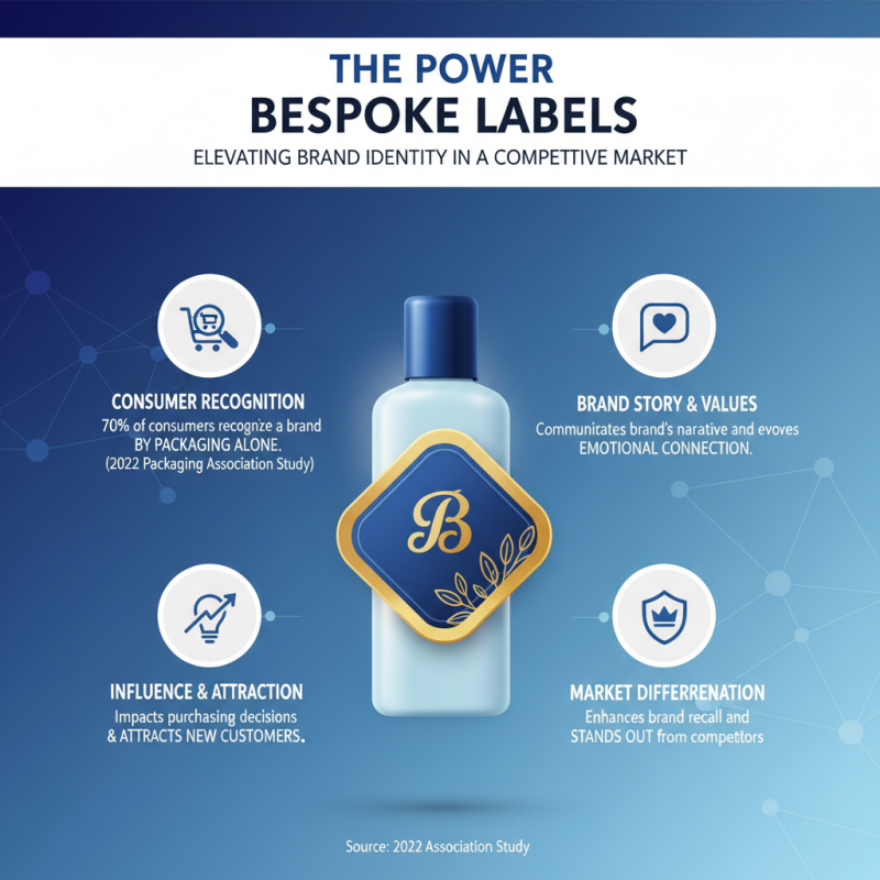
In today’s competitive marketplace, bespoke labels play a critical role in brand identity. According to a 2022 study by the Packaging Association, nearly 70% of consumers recognize a brand through its packaging alone. A well-designed label communicates a brand’s story and values. It can evoke emotions and influence purchasing decisions. Custom labels can enhance recognition, drawing in potential customers.
However, many brands still overlook this aspect. They settle for generic labels that fail to stand out. A survey found that 43% of consumers dislike bland packaging. Unique labels create a memorable experience. They reflect quality and attention to detail. Investing in bespoke labels can create a lasting impression. Brands might hesitate at the cost. Yet, a study from a branding agency revealed that 82% of buyers are willing to pay more for products with compelling packaging.
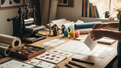
Designing bespoke labels requires thought. Clichés and overused designs can dilute a brand’s message. Experimentation is crucial. Some brands may even find their best design by iterating on original ideas. Authenticity often comes from trial and error. This path may feel daunting, but the feedback loop is invaluable. Engaging with customers during the design process can yield surprising insights.
Key Design Principles for Creating Eye-Catching Labels
Creating eye-catching labels involves a deep understanding of design principles. Color plays a vital role. Bright colors can grab attention, while muted tones convey elegance. Think about the emotions associated with colors. Each hue has a unique feel that resonates differently with customers. Experimenting with color combinations can lead to unexpected results, both good and bad. A vibrant palette can attract attention, but overdoing it may confuse the message.
Typography is equally crucial. The font should match your brand personality but remain legible. Mixing fonts can add flair, but it's a delicate balance. Use too many, and you risk chaos. Observing competitors can offer insights, but simply copying won’t set you apart. Placement is another essential element. Text should be easy to read and well-spaced. Background patterns can enhance or detract from your message. Test the layout to see what truly stands out. Sometimes, what looks perfect in theory may not work in practice.
Finally, consider the material of the label. Texture can enhance the tactile experience. A shiny finish might look appealing, while matte can feel premium. Reflect on how the material interacts with your design. Label durability is crucial, so think about how they will hold up. Creating stunning labels involves trial and error, so don't shy away from refining your designs continuously.
10 Tips for Creating Stunning Bespoke Labels for Your Brand - Key Design Principles for Creating Eye-Catching Labels
| Tip Number | Design Principle | Description | Example |
|---|---|---|---|
| 1 | Use High-Quality Materials | Select durable and eco-friendly materials to enhance the label's quality. | Recycled paper or waterproof vinyl. |
| 2 | Incorporate Unique Shapes | Design labels in custom shapes that reflect the brand identity. | Star or burst shapes for promotional items. |
| 3 | Effective Use of Color | Choose a color palette that captures attention and communicates brand values. | Bold colors for energy drinks, pastel for organic products. |
| 4 | Clear Typography | Select fonts that are easily legible and convey the brand's tone. | Sans-serif fonts for modern brands, Serif for professional looks. |
| 5 | Strategic Use of Imagery | Integrate graphics or illustrations that relate to the product. | Fruit illustrations for snacks, natural landscapes for cosmetics. |
| 6 | Highlight Key Information | Make essential details such as product name and benefits prominent. | Bold product name at the center, bullet points for features. |
| 7 | Maintain Brand Consistency | Ensure labels align with existing brand guidelines for cohesion. | Use the same colors and logo placement across different products. |
| 8 | Consider Label Size and Placement | Develop label sizes that fit the product packaging perfectly. | Small rectangular labels for jars, large front labels for boxes. |
| 9 | Finalize with Finishing Touches | Apply coatings or textures to make labels tactile and appealing. | Matte finishes for elegance, gloss for vibrant colors. |
| 10 | Test and Iterate | Gather feedback and refine design based on consumer responses. | Prototype labels and conduct focus groups for testing. |
Selecting the Right Materials and Finishes for Premium Labels
Selecting the right materials and finishes for premium labels is crucial for any brand aiming to stand out. Research indicates that 77% of consumers judge a product by its packaging. Therefore, your label's material must not only be durable but also visually appealing.
Using textured paper can give a sense of luxury, while polypropylene offers a weather-resistant option. Each choice conveys a different message about your brand.
Consider the finishes that complement your material. Matte finishes provide an elegant look, while glossy ones attract attention. According to studies, 60% of consumers prefer matte finishes for premium products. This preference highlights the need for a balance between aesthetics and functionality. If your labels lack tactile appeal, they might get overlooked on the shelf.
Reflect on the environmental impact of your choices. Sustainable materials are becoming important to consumers. In fact, 73% of millennials feel more favorable towards brands using eco-friendly practices. Yet, achieving sustainability without compromising quality can be challenging. Exploring options like recycled paper or soy-based inks can demonstrate commitment, but remember, sourcing these materials often comes with its own set of difficulties.
The Role of Color Psychology in Label Design Choices
Color plays a vital role in label design. The hues we choose evoke emotions and create connections. For instance, red signals energy and urgency. Blue often gives a sense of trust and calmness. With colors, labels can tell a story at first glance.
When selecting colors, consider your brand's personality. Are you playful, serious, or elegant? Using bright colors may attract attention, but they can also be overwhelming. Sometimes, subtle shades speak louder. Reflect on your target audience. What resonates with them? Testing different palettes can lead to surprising insights.
Don’t forget to consider cultural associations of colors. For example, white may symbolize purity in some cultures, while in others, it could represent mourning. This may confuse your audience and affect their perception. Striking the right balance between aesthetics and psychology is challenging. Each choice could change how your brand is viewed, so evaluate your options carefully.
Utilizing Customer Feedback to Refine Label Effectiveness
Creating effective bespoke labels is a vital part of brand identity. Utilizing customer feedback is key to refining their effectiveness. Start by collecting insights. Ask customers what stands out to them. What do they like about your label? Understanding these preferences can guide your design choices.
When designing your labels, prioritize clarity. Keep fonts simple and legible. Avoid overcrowding the label with too many elements. Try using bold colors to catch the eye. Shift your focus based on feedback. You may realize that customers love minimalistic styles over intricate designs.
Another tip is to test different variations. Consider A/B testing your label designs. Share two designs and see which resonates better. Feedback can be imperfect. Customers may prefer one style but might be unaware of their reasons. Reflections from such tests can lead to valuable insights. Embrace this process to continuously evolve your labels, aligning them closer to your audience's tastes.
Related Posts
-
2025 Top Personalized Labels That Transform Your Organization Style
-
How to Create Stunning Bespoke Labels for Your Business or Projects
-
How to Create Bespoke Labels: A Step-by-Step Guide for Unique Branding
-
Why Are Personalized Labels Important for Branding and Marketing?
-
2026 Top Trends in Bespoke Labels for Personalized Products
-
How to Effectively Label It Labels for Better Organization and Clarity
